
UNO Trade Surveillance
Role
User Experience & Visual Design
Citi’s trade monitoring platform, UNO is used to monitor and review trading floor activity at an average of 8,000 desks per floor across multiple markets and asset classes. Supervisors manage multiple tasks such as algorithm-generated alerts triggered by suspicious activity, periodic reviews, trader attestations, and workbench delegations.
Effective surveillance of trade activity is contingent on user analysis in order to provide diligent framing of intent in the investigation of market abuse. Because the investigation process is reliant on human input, understanding the use, habits, and workflow processes of traders within the framework of the current platform was essential to re-designing an experience that promotes accuracy of behavior analysis and workflow efficiency.

PROBLEM STATEMENT
The current platform is bloated with admin modules for 90% of their user base. The UNO team was looking to determine which modules were relevant to their users and how we could integrate them to promote an Inbox-zero strategy into their existing workflow.
Solution
Design a web-responsive, mobile friendly inbox solution that integrates only the most important modules from the current platform for traders and supervisors alike. Items such as alerts, conversation reviews, and workbench delegations were consolidated into a single, unified inbox where traders and supervisors could review their items on the go. The app was built on familiar mental models to ensure ease of use and lower the barrier to entry for new users.
Service Blueprint
Because there were multiple users and touchpoints, I created a service blueprint to determine knowledge gaps in the system.Red areas indicate missing information regarding user interaction.

Goals
Web to Mobile Responsive Design
Zero Inbox Strategy
Focus on two key personas: Traders & Supervisors
Reduce cognitive load by designing a notification system that alerts the user when a new alert or task has been delegated to them, has been changed, or approved.
Build on familiar mental models to create a usable application with a low barrier to entry.
Re-design the nomenclature of various tasks
User Interviews
I conducted 9 interviews with traders and supervisors; each user managed a different product (i.e., FX, Equities, Loans, etc.).
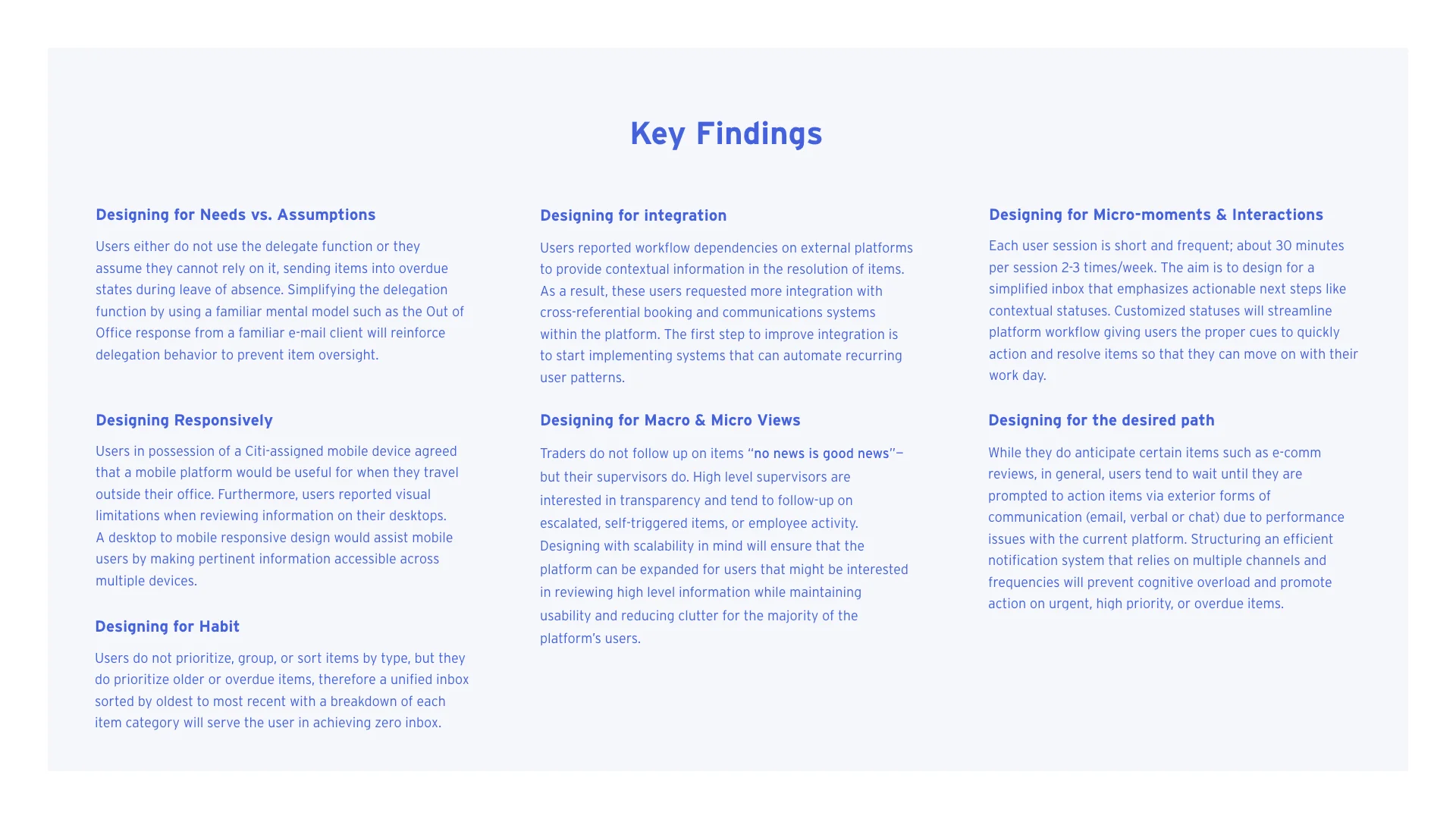
Based on these interviews, I came up with 7 key findings; feedback that was consistent across users. I then turned these into principles to help manage design decisions with the stakeholders. Every design decision can be tied back to these key principles:
Visual Design
I built the visual design from scratch as the stakeholders didn’t have a style guide, design system or pattern library to adhere to. This was largely due to the fact that it’s an internal tool. After 90% of the screens were designed, I went through and documented all the patterns and their related specs including typography, colors, iconography, buttons, drop downs and more.
System Status Screens
Loading and error states denote that the system is processing their request and that progress is being made. Visibility of system status continually updates the user on what’s going on to minimize user tension.
In this design, ghost screens create the sense that things are happening immediately as information is incrementally loaded on the screen.


